Bakery Landing
Page
Project overview
Project Type: Website redesign
Role: UI/UX Designer/p>
Tools Used: Figma, Photoshop
Languages Used: None (just a design)

Project Type: Website redesign
Role: UI/UX Designer/p>
Tools Used: Figma, Photoshop
Languages Used: None (just a design)

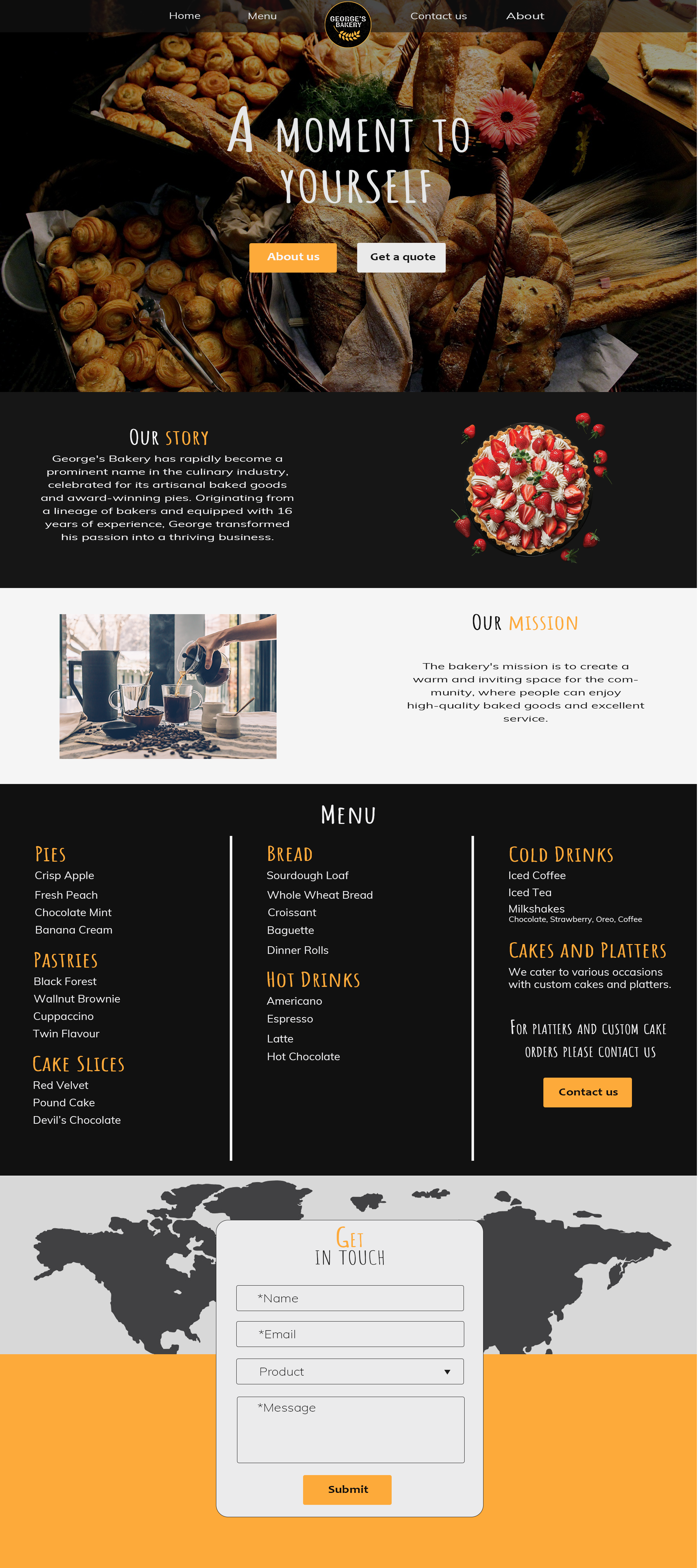
Before the redesign, George's Bakery's website had several usability and design challenges:
🔴 Outdated visuals - The website didn't reflect a modern, inviting bakery experience.
⚠️ Poor readability - Small text, a dark background, and weak contrast made reading difficult.
🔄 Cluttered layout - Information was hard to scan quickly.
📉 Weak menu hierarchy - The structure made navigation frustrating.
🚫 CTA buttons lacked visibility - Leading to lower conversions.
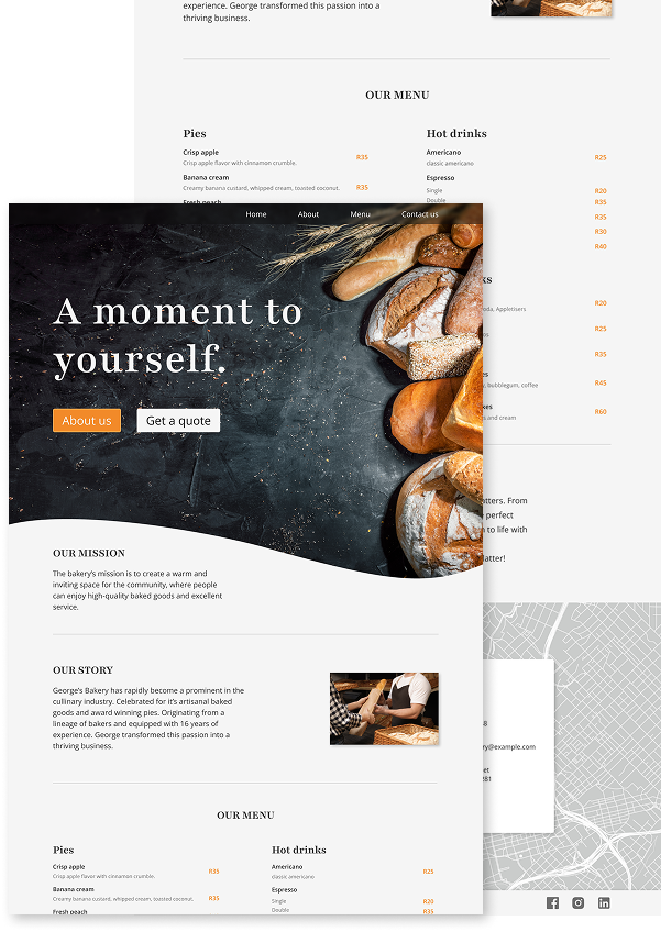
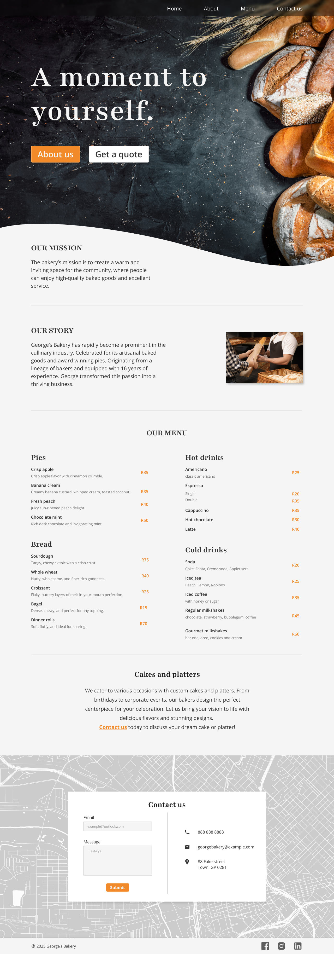
To improve the usability and aesthetics of George's Bakery website, I focused on key design enhancements:
🎨 Modernized Visuals - Emphasizing design improvements.
👀 Improved Readability - Highlighting better text visibility.
📖 Decluttered Layout - Representing better content structure.
🔗 Better Menu Hierarchy - Symbolizing organization.
🚀 Enhanced CTA Visibility - Indicating better conversions.

