1. Project Overview
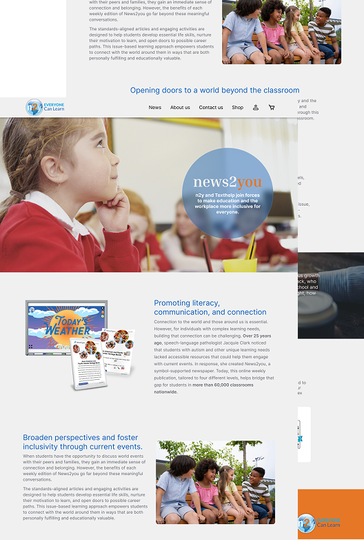
As part of a college project, I redesigned the News2You website using WordPress to improve its visual appeal, accessibility, and user engagement. The new design focuses on inclusive education, modern layout structure, and easy navigation. It highlights key offerings like educational resources and teaching tools while ensuring a responsive and user-friendly experience across devices.
2. Main Design Changes
🎯 Simplified Navigation - The original layout uses a bulky sidebar menu that can feel disconnected on larger screens. I introduced a cleaner top navigation bar to streamline the user journey and make key links more accessible.
🧩 Visual Hierarchy - The original page uses inconsistent text sizes and spacing, which makes scanning difficult. My redesign applies consistent typographic styles and spacing to create a clear visual hierarchy.
🌈 Refreshed Color Palette - The original color palette lacks visual contrast and doesn't highlight CTAs effectively. My version uses bold contrast for buttons and sections to guide users more intuitively.
🖼️ Improved Image Use - The original design uses oversized images that overshadow important content. I balanced media with supporting text to improve content flow and clarity.
📄 Organized Content Blocks - Content on the original site feels dense and repetitive. I grouped content more logically with white space and headings to improve readability and engagement.
